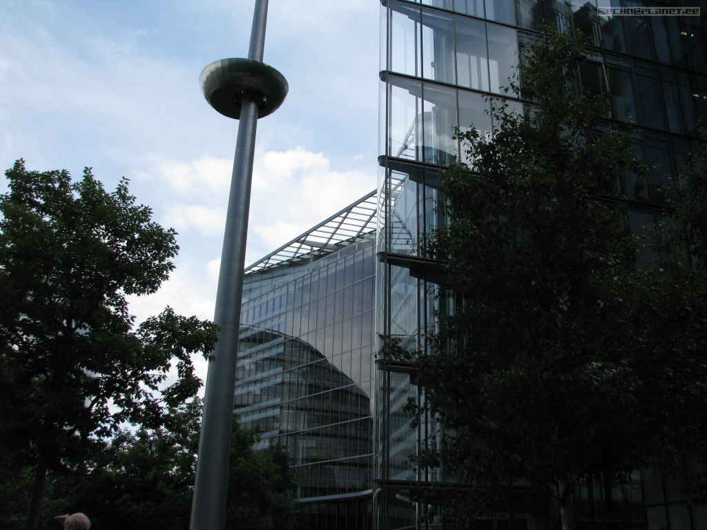
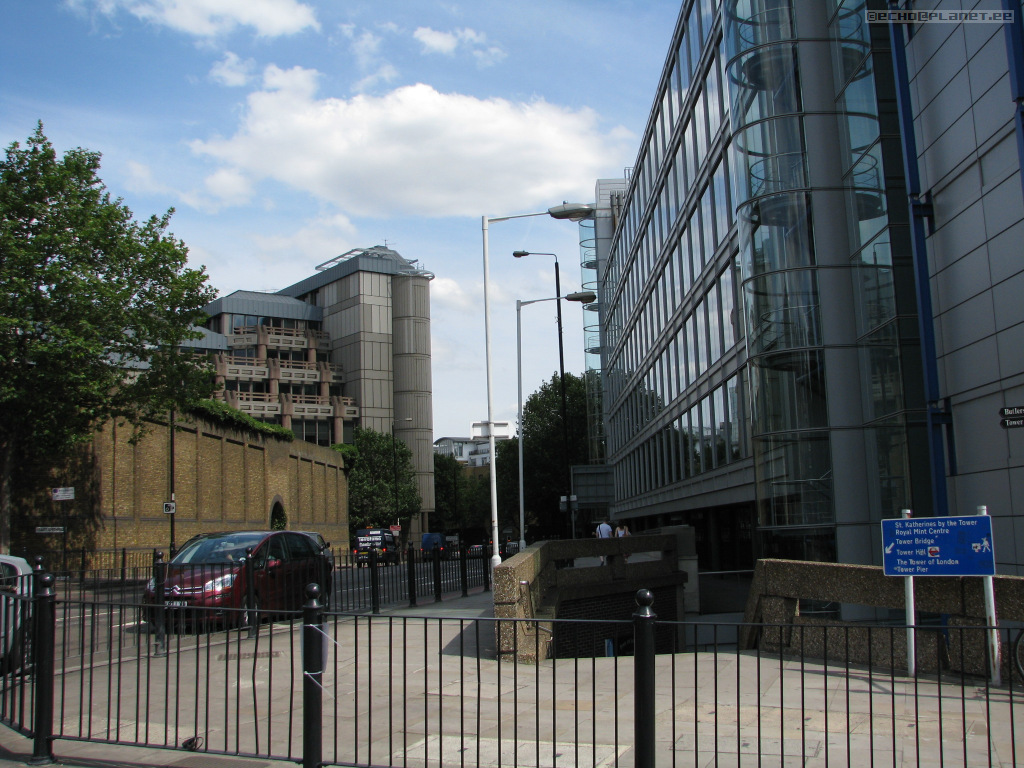
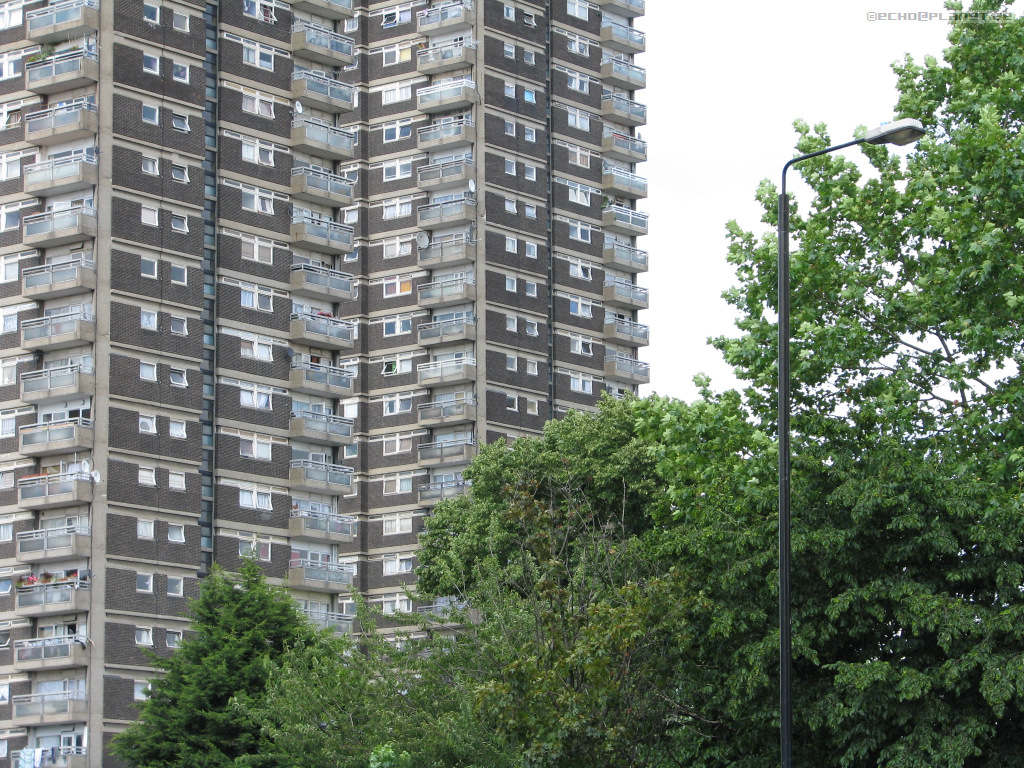
I don't like this.
Video from Tower Bridge, looking houses around: http://youtu.be/b3p10KfLUBA.
Trojan? Horse? Virus?
Very nice way for making blocks looking interesting and stylish.
I prefer the style above anytime for this. I think this is cheap and blunt.
What happened? This is a crime in architecture. I like long balconies and above plates, but the overall impression is terrible because of the colours, surface and bad-looking randomness.
Everything was so nice and enjoyable. I just took almost randomly some of these first photos and created a video with some special background music / experiment / ambient: https://youtu.be/SL-alTlxrTI.
As a total opposite of the hideous example above, this is probably the best architecture of this kind that I have ever seen. This is so beautiful that I'm gobsmacked about it even years later.
Looks like 1960's, like many in this area.


No comments:
Post a Comment